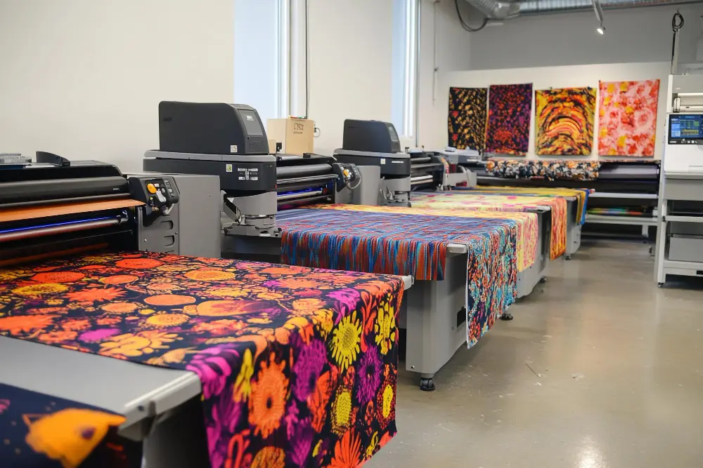
When looking for business card printing near me, one may easily fall into the trap of opting for the quickest or most affordable option. However, hasty selection or omission of key design and printing procedures can result in poorly designed cards that fail to project your business well. Business cards tend to be the initial encounter that an individual will have with your brand. A poorly printed card, poor layout, or substandard material can say a lot against your professionalism.
Most companies, particularly small and local companies, depend on design print services to manage the creative and technical aspects of their branding. To maximize the benefit of your investment, though, it’s best to steer clear of the most frequent mistakes in business card printing. Here’s what you need to remember to make your cards effective and professional.
Overcomplicating the Design
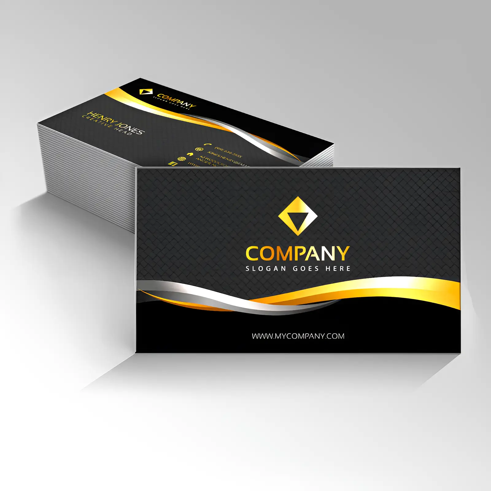
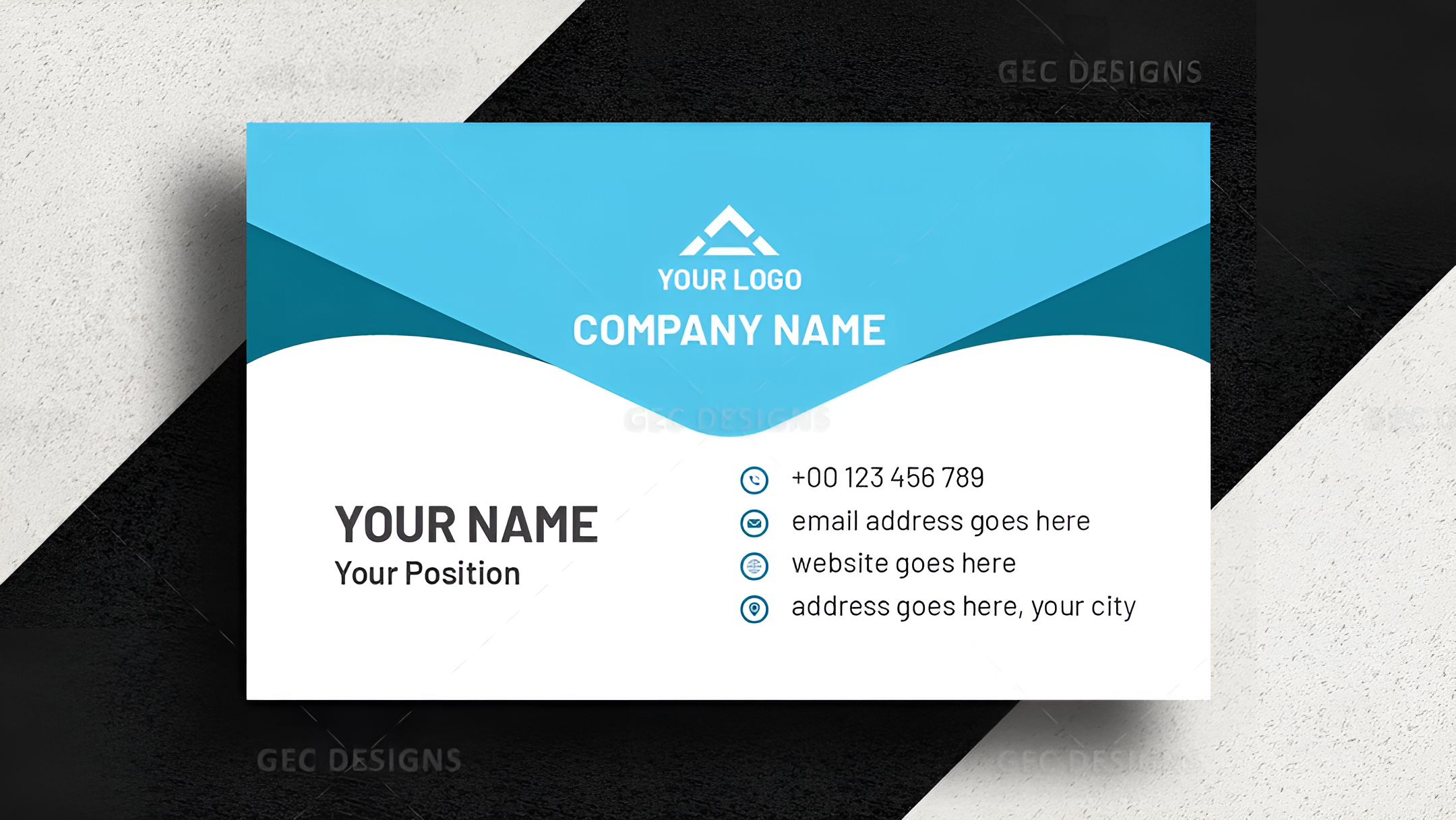
A business card needs to be clean, concise, and legible. Too many people pack too much into a little space—logos, photos, designs, contact information, social media handles, QR codes, and taglines all vying for notice. This makes the design look cluttered and less effective. Select one or two impact statements that reflect your brand. Ensure your logo is legible and your name and contact information are easy to locate.
Keep your fonts readable and do not use more than two fonts. White space is not blank space; it leaves the design some space to breathe and contributes to the overall professional appearance.
Utilizing Low-Quality Images or Graphics
Resolution is important. If you use images or logos that are pixelated or blurry, it telegraphs that you don’t pay attention to detail. Always be using high-resolution files and vector-based logos. Professional printing services for design can make sure your graphics are set up correctly for print, so there are no nasty surprises when the finished cards arrive.
Overlooking Color Consistency
What you see on your screen is not necessarily what gets printed. Screens employ RGB color, but printers employ CMYK. If you’re not converting your colors for print, your brand colors may appear dull or entirely different. Convert your design to CMYK before printing always, and if you can, ask for a printed proof. This little trick maintains your branding consistent on all materials.
Using the Wrong Paper Stock
The paper you use reflects a lot about your company. Flimsy, thin paper looks inexpensive and less durable. If you are distributing cards at events or meetings, you want to make a strong impression—not tossed or ripped. Use heavier stock, matte or glossy coating, or textured paper for that high-end feel.
Certain materials will also work better with specific print techniques. A good design printing company will walk you through paper and finish possibilities to ensure that your design objectives and budget are met.
Omitting Key Details
It’s surprising how often people forget to include essential contact details. Always double-check that your name, job title, phone number, email, and website are included. If you’re active on a particular social media platform that’s important to your business, include that as well.
Also, don’t make people search for your information. Keep the layout intuitive. Use icons for phone, email, and web links if needed, but avoid visual clutter.
Employing Borders or Design Elements Too Close to the Edge
Don’t place borders or text near the edges of your card. If business cards are bulk-printed and cut, there are minute movements in position. Borders may appear chopped off or lopsided. Keep bleeding and safe areas in mind at all times. Have at least 3mm (1/8 inch) between your critical elements and the edge of the card.
Not Considering the Audience
Your business card should be tailored to your target audience. For example, a graphic designer might want a bold, creative card, while a lawyer might prefer a clean, classic design. The design, colors, and even card shape should reflect your brand and resonate with the people you’re trying to reach.
Selecting odd shapes or materials may be eye-catching, but they could also be inconvenient. Consider where and how the card will be employed. Will it fit within a regular wallet or card pocket? If not, it might get tossed.
Avoiding Professional Guidance
One of the largest errors is doing it all yourself. DIY tools are great, but without design experience, what you have at the end will look amateur. Professional design print services provide value far beyond getting ink on paper. They assist you in getting a design that suits your brand, utilizing appropriate colors and arrangement, and ensuring the finished product looks professional.
Even if you have a simple design, having a second opinion or using the services of a printing expert can spare time and avoid expensive mistakes.
Not Proofreading
This is perhaps the easiest error but the most disastrous. A spelling error in your name, email address, or profession immediately reduces your credibility. Check over your design several times. Have someone else check it. It’s simple to overlook errors in your own designs. Once it’s been printed, correcting a mistake equates to reprinting the whole batch.
Omitting the Print Test
Always request a sample or proof before a full run. This allows you to verify color accuracy, feel of the material, and print quality. It is your last opportunity to find a problem before ordering a large amount. A simple test can save waste and make your cards appear just as you envisioned.
Final Thought
Avoiding these common mistakes can make a huge difference in how your business cards are received. If you’re serious about presenting a professional image, working with a trusted partner is essential.
At Emperorprinting, we know how significant every detail matters—from design to print. We don’t simply provide great business cards. We provide guidance, professional service, and quality you can trust. If you need assistance with layout, paper selection, or print finishes, we make sure your cards represent your brand at its best.
Ready to make your first impression matter? Let Emperorprinting work on your next business card project with care and attention to detail.
FAQ :
Some common mistakes include cluttered designs, low-resolution graphics, inconsistent colors, poor-quality paper, and missing contact details.
Screens use RGB color, while printers use CMYK. If colors aren’t converted properly, your printed card may look dull or inaccurate.
Keep the design simple and readable, use high-resolution images, maintain spacing from edges, and avoid using more than two fonts.
Paper stock affects how your card feels and lasts. Thick, textured, or coated paper gives a more professional impression and increases durability.
Yes. Always request a printed proof to check layout, color accuracy, and material quality before placing a full order.